Wednesday 19 April 2017

Reflection on Assignment 5


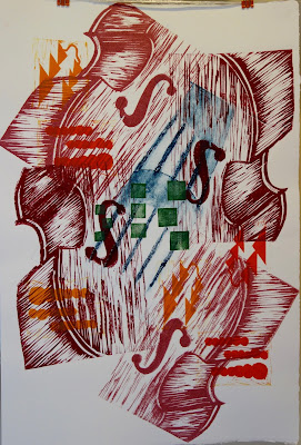
My final submission for assignment 5:


In terms of assessment:

  • Demonstration of Technical and Visual Skills - materials, techniques, observational skills, visual awareness, design and compositional skills
    In all of these assignments I think my composition skills have developed better than my technical skills. While my technical skills are not bad by any means, I still face some registration problems at times. My chine colle prints had more technical issues, I found this process challenging. My composition skills however have developed with these varied sets of prints. By producing very varied editions I have been able to continue to explore composition and design throughout the assignments which has allowed me to develop my skills in this area. 
  • Quality of Outcome - content, application of knowledge, presentation of work in a coherent manner, discernment, conceptualisation of thoughts, communication of ideas
    I have explored some really varied ideas in these assignments and think I have communicated these varied ideas well. My final prints were ambitious, and the concept behind them was abstract but I think clearly communicated. Whether my music and art ideas could have been presented more subtly, or more abstractly is an idea I would like to come back to in the future, and whether this may improve presentation is something I am unsure of at the moment. In projects 13 and 14 the prints did not have such a strong conceptual background but I was trying communicate different moods with the variations of this print, something I feel I have achieved by the diversity of the outcome.
  • Demonstration of Creativity - imagination, experimentation, invention, development of a personal voice 
    This I hope is a strong area of my work. previously I had been more cautious in my choice of subject, I have been much more ambitious and experimental this time and I think this has lead me to develop the beginnings of a personal voice. Thinking big from the outset in project 15 certainly stimulated much more ideas, and now I have finally managed to achieve a better sketch book habit I have been able to capture and explore these in interesting and creative ways in a big range of media. Being more experimental with media in my sketch book definitely helped me develop more ideas and be more creative in these assignments. My water mono prints in project 13 was a really good open starting point for this block, I was able to explore so many variations which continued to develop into my chine colle prints in project 14.
  • Context - reflection, research, critical thinking (learning log) 
    I have kept an honest and thorough learning log. I am limited in my access to galleries but those I did visit prompted much further research and greatly informed my artwork. I have learnt a great deal about how artist's communicate through this research which I hope comes through in my log but also in my artwork. Due to my location I have been reliant on web sources for much of this research but have analyzed it critically, carefully assessing sources for reliability.
Tuesday 18 April 2017

Final Prints, Assignment 5

For my final series of prints I had one large block


shown here printed twice
 And some smaller motifs the green block is a collagraph, the red and orange are lino

I explored a range of compositions of these blocks.


Supporting Statement
Mingus IIBS


In my final series of prints I wanted to explore an abstract theme I had researched and touched upon in my explorations in earlier parts of the course; the interpretation of music through art. As a musician, music will always be my first love, it seemed natural to bring this into my artwork in this final project.

I chose an all time favorite piece of music of mine and my late Dad, Mingus IIBS, a piece of jazz with prominent double bass solos (I play double bass). At the outset I was not sure how I would represent the linear nature of music through a static artwork but as my explorations developed that became less important. I researched many artists who have interpreted music visually but the most significant of these was Richter and his series of paintings inspired by Cage. He did not try and interpret small details of shapes of lines or colours of harmony, he took the same compositional approach as the composer and worked towards the same aesthetic. This opened up the whole subject for me and helped loosen up my ideas.

I cut a block of a double bass to create the foundation of the piece reflecting the starting and ending solos and founding bass line running throughout, and explored different layouts of this. I then added another structural element of the strings in the centre, some of which I printed as a collagraph, some as monoprint. The rest I composed freely in the nature of a piece of jazz. I cut motifs representing the head and another repeating stab chord motif that would have been planned written out aspects of the composition but experimented with different placements of these. The solos I printed as freer monoprints of coloured lines as the final layer to reflect the way they are performed.

In comparison to a piece of jazz music the prints had a planned structure but not one that is rigdly composed or that can exist in only one format. A piece of jazz like this could be performed in many ways, and may be varied from performance to performance. To reflect this I did not use a traditional registration system, many blocks were placed by eye on top of the paper and then the paper and block were turned over. The small blocks were placed on top of the paper and printed with the block uppermost to allow control over the composition. All of the prints are different, as would all performances of the piece be. I found the final layer of monoprints not as effective as I had hoped. I kept some images without this layer as the impact of the image was lessened by overcrowding. As an experienced performer, I know that in music solos, parts and sometimes whole sections of pieces would regularly be cut for exactly this reason, clarity of composition, and the image more clearly shows the head and bass motifs without the monoprint solos so I have kept some simpler.


Supporting work:
Designs
Picasso Violins
Jazz Research
Richter


Final Print Designs

Having decided I wanted to use a double bass as the foundation of my print, as it is the foundation of the music, I drew my bass from different angles as I am interested in looking at it from different perspectives to represent different sections of the piece. I then photocopied and collaged these drawings with some photos of basses


To be able to develop these more I traced off the outlines so I had a bit more space to draw and experiment.

I was really pleased with this layout. I feel I can still vary this and create a varied edition of prints and I've got enough space in the middle for my motifs and mono prints. I will  use the same block turned upside down for both sides of the bass and cut a different block for the centre.

Picasso Violins

After playing around with explorations of structural shapes to represent Mingus II BS I tried one based on the outline of my double bass and put all my shapes and lines for all the different sections inside it. The bass begins and ends the piece, it is the foundation and continuos line throughout.


This exploration reminded me a little of Picasso and his violin and guitar paintings:


Guitar And Violin


Date: c.1912
Media: oil,  canvas
Dimensions: 54.3 x 65.5 cm
Location: Hermitage Museum, Saint Petersburg, Russia


CĂ©ret and Sorgues, spring-summer 1912

These paintings are both early cubist style of analytical cubism. The object is viewed from multiple angles and the image is made up of multiple viewpoints and overlapping planes ("Analytical Cubism").

In my exploration I realized that the outline bass would have to be very large to allow me space to complete all the details I want to add to this. I could try another version where I use drawings from different angles for different parts of the instrument and different sections of the piece. Each section of the piece is a different plane and they overlap making one image. Each section could be a different block.

"Analytical Cubism". Tate.org.uk. N.p., 2017. Web. 23 Mar. 2017.

Jazz Research

In my previous post about Richter's work after John Cage at the Tate Modern I identified a method of translating music into art, using the same compositional strategy or philosophy as the composer to create the artwork. In this example the shared philosophy involved the use of controlled chance. On reflection, in many art forms where there appears to be a high degree of chance utilized this is often not the case. Jazz is a good example. There are many rules and parameters which govern the improvisation in jazz.

Three methods of Jazz improvisation are melodic, harmonic and motivic. I explored the differences between these visually. I designed a motif to represent the main tune of the piece and used that as the basis of these explorations. This motif is partly based on the shape of the tune but also is similar to articulation notation symbols.


This gave me some ideas for motifs and shapes.
Going back to my research on Richter, to try and compose my artwork in a shared philosophy as Mingus, I need to understand his artistic intention:

Planned structure x number measures per section
Wrote head
Allocated solos
Planned ensemble sections
Planned chord progression

Richter took 1 aspect of artistic intention, or general artistic intention, not specifics like this. This could be:

Framework plus free improvised aspect, framework could be linocut improvisation mono print
I could make a timeline into a box or circle, improvise within it? I can improvise in art as well as in music.

I constructed a timeline and used this to make some structures which I filled with colors and textures based on the music.


These were a bit too rigid. One thing I did notice is that the double bass is the structure, it begins and ends the piece and drives and supports it thought and may be a better way to represent the structure.

Chine Colle Prints

I printed a range of chine colle prints, mostly based around the tree block I have used for my mono and lino print developed from designs and ideas previously explored in this post. I printed my block onto fine paper, turned it over which gave me a reverse image then applied this as chine colle. It was hard to chine colle such a large piece of fine paper so precisely.


This was the more successful print, I tried to balance the image by adding leaves at the bottom but these did not adhere well. I really like how the trees overlapped.


I tried to trap a fern leaf under the tissue paper in this print but this was not successful. The extra adhesive on the leaf made the ink smudge.


This simpler design was more successful. The tree with no leaves was already printed, hence it is behind the chine colle papers I applied while printing the palm tree. I like the depth this created but could have put more thought into the composition. I wanted to create the illusion of mist surrounding the trees, this was partly successful.


This print was the simplest and most successful. I overprinted the palm tree with new tree block and just added dark paper at the bottom to represent ground and balance the block. I think this composition works well.


This print was a mono print that I collaged over when exploring papers and adhesives. I then printed and added more paper as chine colle and some small highlights with foil. By using multiple layers I was able to build up a lot of depth. I noticed in this print than the more absorbent papers print thicker, darker lines. The dark blue in the fore ground is a bit too dark unbalancing this slightly.


I tried a different block for this print. I wanted to keep it simple as the print itself has so much texture. This is a bit unbalanced, the green could have been shorter. I think this is a good example of when using the rule of thirds would have created more balance.

In this project I did not cut a new block as I felt I had many unexplored options with my tree block that I began when developing the design. Because I began this design with mono print it had already gone in a range of directions before I got to this stage and I wanted to see how far I could take it. Now I understand this technique I could plan a design confidently using this technique.


Monday 17 April 2017

Chine colle ideas

My first practices of chine colle were a bit frustrating. I explored the papers and cellulose adhesive I plan on using though collaging over my less successful mono prints. I also tried cutting a large piece of tissue and applying foil behind small slits. It was too complicated, the paper folded up and I couldn't get the foil in the right place. What I did learn was that the ink behaves differently on different paper. I practiced some prints on some fine papers to get an idea which would print well and which would be too absorbent and bleed or not absorbent enough and not take the ink well.


I printed my block on very thin paper and found it showed through so well on the other side I had a reverse image I could use. This gave me the idea of layering the image over itself for my chine colle prints, I will need to extend the lino block for this to work, I will get funny embossing. I used my acetate drawing flipped over and laid over some prints to try out some layouts. This is extending ideas I had in my sketchbook of varying the composition of this print.


I got interesting results. The ones I like better are


I need to add something in the bottom left to balance this, perhaps a 3 rd impression of transparent ink layered over? Chine colle colored paper? chine colle leaves? mono print background? I could use leaves to create textured background.

This needs something bottom right to balance it, chine colle leaves? Large piece of paper for 2nd tree, whole width, no edges, bottom edge hidden by darker paper section.

I also laid the acetate over some prints that could be developed:

I like the simplicity of this, the acetate reflection is distracting in the photo. The textured blue could be a mono print, the chine colle tree would be torn edges and blended to create a soft edge. Or, use a palm tree block from a previous assignment and keep this base print, add some chine colle as small detail or texture. This could be a pair of prints, two trees.
The two trees could be a palm and the other new block, trunks together or apart over mono print of leaves, with chine colle leaves over, I have dried leaves brought back from England. This would be interesting with Saudi leaves to add.


This blue print may have been printed with water based ink, chine colle may not work well. Try printing tree over the top with some chine colle detail, perhaps at the bottom to balance it.