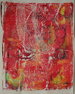
This print was a combination of masks and texture. I used fabric and bubble wrap for the texture. I drew several studies of coral to generate the shapes for the masks. This meant I had lots of shapes to choose from and was able to get a good balance of complexity. The paper was medium weight cartridge paper and computer paper for the masks. The masks left a white edge around the shapes, which I think adds definition. I was particularly pleased with the strong flat colour in contrast to the paler textured background. I think this is strong technically, with good control over the surfaces. I also think this is a good quality outcome as the print is clean and clear. This print is my most developed idea and I think shows the best supporting work and developed creativity.
This print is a contrast to the first print as it was much more improvisatory. It started as a painted print. I added 3 layers of prints over the top of each other then a mask, I did two layers of the mask to create some depth and then another layer for the bottom half as it looked like it was floating in the air. That was a lot of ink and it was slow to dry. The mask and the painting did not line up well, I like the unpredictable and uncontrolled aspect of this. I have created some good texture through the painted layers, some of which contained some texturing by removing ink with the brush handle. This is framed by the mask effectively. I did a brief supporting sketch of this to get some shapes for the mask. I think this is a less strong example of my skills, and the print is less neat. If I had been less impulsive and let the ink dry between layers I may have got a better finish. I think this is a strong example of showing my creativity through experimentation.
This print is a combination of a painted print with texturing. I used a cotton bud and paintbrush handle to remove ink. It was taken in one layer. I was really pleased with this from a technical point of view as the areas where I removed the ink to create the lightest values were very effective. I wanted to show the light reflections and I think I did this well. I did a preparatory sketch on black paper with a white pencil which I have sent in but unfortunately did not photograph. This was my third attempt at this print. This does not show very much creative flair or personal voice.
This last print was taken on my gelli plate with acrylic paints. I made practice background textures and practiced painting the plant first, these are below. I like that this shows a very different approach to a painted print. It shows a much freer style because of the different medium which I think shows my technical abilities in a new way. The background is textured using leaves to reflect the textures of the plant and the colours allow the yellow highlights in the plant to stand out which I think is effective. This print is more expressive in its loose relaxed marks.
Overall I think I've demonstrated good technical skills and shown a good range in this area. I don't feel I have achieved so highly in the other areas. I wasn't sure if there should be a connection between the works but I do not feel I have developed a personal style or voice yet. While I feel I have developed creatively and been imaginative in my use of processes I have not got to a stage where I am communicating or expressing anything significant. I also feel that although I did some research this did not make much impact on my work.
For the next assignment I need to be more consistent in keeping a sketch book. The supporting works I sent in were taken from many different sketch books. I will use this to develop my ideas further and show connection between research and artwork created.


