Friday, 14 August 2015

Tracey Emin Monoprints and Blankets

Tracey Emin is not an artist I have ever paid much attention to. I was aware she made textile pieces, but they always felt so far away from my own aesthetic that I paid little attention. While researching monoprints I was surprised to find these works by her
Terribly Wrong, 1997

Sad Shower in New York, 1995

From the Week of Hell '94, 1995

They are all depicting very personal events, such as an abortion that went wrong in 'Terribly Wrong'. She has used back drawing to create them and I cant help wondering why. What has the process of monprinting given her over simple drawing? I wonder if the process has somehow distanced her from the final product, by using a process where complete control of the finished product is taken away, such as monoprinting, she was able to express herself more freely.
I have been  doing lots of drawing recently, all of traditional still lifes using traditional techniques in preparation for a class. Perhaps some more expressive uses could be found for my newly refined skills, to include the next stage from the OCA Printmaking class on monoprinting which includes back drawing. Am I brave enough to depict my innermost thoughts and anxieties in monoprint? I'm not sure I like these images particularly, but they have certainly got me thinking. Would they make any sense without the titles? I'm not sure. They are generally displayed together and their effect is a collective one.

Emin's monoprints and drawings are reminiscent of quick sketches drawn from life, as if she was using back drawing as a medium for gestural drawing, brief, figurative sketches, caught quickly as the subject moves. My earlier post on monoprinting shows an image of moving traffic, with movement created with blurring of the ink, Both of these suggest moving subject matter, could these two ideas be explored together? 

However, these images are more likely to have been drawn from Emin's subconcious, would drawing, or back drawing images from my memory, describing my own emotions, be an area I should explore? I could never be as open or free in my art as Emin, very few people are, but this may be a good way of loosening up as an artist and generate some interesting ideas for more expressive work.


Hate and Power can be a Terrible Thing, 2004

Emin's blankets are an unusual use of the medium. They are not art quilts, no joining of quilt layers took place, they are constructed by hand applique onto a prepared background. She has created a big contrast between the soft comforting medium of a blanket and the strong words. The message here has personal connotations but also powerful political messages too. Some of these blankets were created around the time of Tony Blair and George Bush's war in Iraq, with anti war themes. This a theme I identify with hugely personally. All the artwork I create is developed from an aesthetic perspective, could I develop broader themes in my work? Maybe these ideas come later in the development of an artists skills, but still interesting none the less.

All images taken from the Tate website. 

Thursday, 13 August 2015

Monoprints

I've signed up to a class with the Open College of the Arts called Introduction to Printmaking.

I have wanted to take my creative ideas a bit further for a while so have chosen this course. I have used linocut before and really enjoyed the process. I hope to follow it with further courses in textiles. 

The first unit is on monoprints. The unit starts with painterly monotypes, created by painting an image onto a printing plate and taking a print from it, I found this process quite difficult, especially regarding judging the right thickness of ink to use and keeping it even.

Here is a fantastic example by Toni Martina, Cross Roads:


 I have looked at this image really closely and it looks like a really thin layer of ink has been used, the brush strokes are visible and the ink has been scraped away in places too. The smudging is really effective in creating movement. The bright colours are very effective. There is little detail in this image, its impact is all about the movement. There is very strong contrast in values, the centre of the image is made up of intense colours, bright whites and strong blacks. I think monoprint is an effective
medium to create this contrast because scraping away inks gives bright whites. The technique also lends itself to these large areas of flat colour, too much detail is not easy to achieve. This also gives strong contrast to the smudged moving vehicles.

The most popular use of monoprinting seems to be creating an image through removing ink from a plate rather than painting it on. This image by Degas is a beautiful example of this style:


Here the image also contains movement created by some smudging of the ink. The dancers are composed with great energy. Again, strong contrasts of value are use to great effect.
Degas produced many monoprints and also worked over some with pastel creating interesting textures. This is a good example where the strong value contrast of the monoprint is enhanced with mid tones in pastel:

I found it hard to get all the materials I needed to get started, as I live in Saudi Arabia and mail order is very slow. I started with poor quality ink that was of inconsistent thickness and very hard to work with.

In these prints I tried to create effects by removing ink as well as applying it in different thickness's


These earlier experiments with poor inks taught me that the thickness of the ink needs to be well controlled. I bought better inks from Amazon. These water soluble oil based inks are very thick and my first detailed image was much drier by the time I took the print in the image on the left, in the image on the right I got a better result by wetting the paper. In the print on the right I was painting a white ceramic jug, it was challenging to paint in white paint and still use the exposure of the paper effectively.


I continued wetting the paper for these prints and was able to take 2 prints from one image. My five year old daughter helped me here reminding me to add shadows, very observant, I see artists eyes developing in her! I was quite preoccupied with creating highlights by scraping away paint and despite her reminders did not quite get the shadows right here, but I am pleased with the highlights.


In this test print I practised painting and removing ink for the fish image I was planing from a coloured pencil drawing from my sketch book:


I wet the paper before taking the print. This could have been more subtle in the texture of the background


My original drawing


The above inks came in very small quantities. The following images are made with different water based inks. I found these inks wetter, easier to work with. The first print I ruined by wetting the paper and it smudged badly. This test was done to test the colours with dry paper


I made a sketch with white pastel pencil to practice drawing in the light values as done by many monoprint artists


This is the print. Some areas dried too quickly and did not print well distorting the value, the table should have been darker but overall fairly effective


While I am pleased with my progress with this technique I have found it challenging. I am not a painter so perhaps did not have the background skills other course participants may have started with. This course can be taken as part of a BA in painting. 


Saturday, 20 June 2015

Craftsy Class Creative Darts and SeamlinesMcCalls 6696

I've been working on this class for a really long time. After two wearable muslins of the A-Line dress I think I have the fit sorted on this which I can transfer back to my sloper. Why did a custom drafted pattern take so long to fit? Who knows, maybe I didn't measure well. The areas where I had problems were the armholes. In the moulage draft it didn't look right. I cant remember exactly when but some point she has you use an industry standard measurement of placing a new bust line. This put this much too high and made my armhole too small. Is this method unsuited to ladies with larger busts? I'm not sure, possibly I just did it wrong. Suzy replied to my questions very promptly and was really helpful. So now I think I have it in this simple dress:


I took the sleeves from McCalls 6696, and altered the armhole by making a 1/2" armhole dart, which I left unsewn for a bit more ease as directed in the sleeves drafting course which I am yet to embark on. I thought going through this process would mean no more fitting, but I was wrong. You have to be able to fit to draft patterns, and if you have an unusual proportioned body in any way it is going to throw up problems in any method of making clothes. All my clothes, me-made or shop bought feel or look awkward in the sleeves. I often have extra fabric around the front arm hole and not enough room to move, more specifically play the double bass in.
This class gives directions for many garments, many of which are very fitted, which doesn't really suit my life in a very hot country. This is one of the looser fitting patterns, there is also a swing line top and baby doll line pattern. No finishing details are given like necklines or closures.
This dress is made in fabric called crepon de coton from les coupons de Saint-Pierre. This shop is in Paris but despite the delivery still fantastic value and quality. I couldn't work out what to do with this fabric for ages and then ordered some double gauze from fabric.com and discovered it is almost the same, slightly heavier but still light and drapey. I could then look up what other people were making with this and I knew it needed to be used in something loose and unstructured. I took the neckline from a pattern that came free with a magazine ages ago. 
So now I'm over the hardest bit I hope? I'm going to make this again in something firmer to test the fit again, hopefully it will still look ok, then maybe try and draft some sleeves, although I've run out of enthusiasm for this process a bit now, it is so time consuming!

Monday, 18 May 2015

Playing with Piecing

I had this idea that I would create something that starts with a traditional quilt block and then goes off in a different direction. It makes sense for quilt art to start out with a quilt, right? I deliberately didn't choose a final outcome, I still don't know if I'm making a contemporary functional quilt or a hanging piece or both even. I also decided not to do any drawing to start with. I love drawing and get totally lost in it. I need to get some drawing projects going that are just drawings for the sake of drawing, then learn how to not over work every sketch, as it slows me down enormously at the moment.

So first I chose a quilt block. This free class from Craftsy has some good blocks. I chose June: Y-seam construction, Lemoyne star. It has lots of interesting angles that I hope will make interesting shapes.  I made the first units, I sewed 2.5" strips together then cut on 45% angle to make the parallelograms that will be sewn into diamonds. I then played with a few combinations:
     

 Here is the original block on my design wall in a couple of colour ways. Beautiful as this is I want to see what I can create by messing around with it.


I quickly brainstormed a list, I called it 'abstraction of a quilt block' quite a grand title, whatever, it will do. I came up with:

Alterations- rearrange existing elements, alterations, gradually make more altered blocks, blocks in blocks, inversions. These two blocks I've just rearranged the existing elements.


 Colour changes can change the pattern, I like this one on the left where the red diamonds float in a circle and the star disappears in the background.


Next I slashed the whole block


No block format - exploded elements


Block partially obscured


Repetition of elements, new elements made


This last picture is a bit mad, I will definitely not be making something this busy, but it is useful to look at a whole new combination of elements like this. I kept the star and accidentally made some tumbling blocks on the left.

I have a few other ideas:

Use of patterned fabric- big patterns like bold stripes can alter design, quilted designs
Change of scale
Wonky piecing
Negative space around block

Layering over block - stamp over block, thread embellishment, applique, tulle and other fabrics, feature quilting

I am not mad about the things I have tried so far. I need to alter it more radically, get further away from the block format and I think I need to introduce some different sized units as it is just too regular as it is. So next time, change of scale and negative space. Back to the design wall, not the drawing board.

Linking up with Nina Marie


Thursday, 30 April 2015

Skirts, skirts, skirts


Season-of-separates-square-banner


Over at the curvy sewing collective they are hosting a season of separates. This month is skirts so at the eleventh hour I am adding a few of my recent makes so wanted to add them here too. I've been getting my son to take pictures of me all week, I think it really adds a professional edge to a blog when the photos are taken by a nine year old! It is so useful to review them all together. All of these are self drafted, about five minutes after I sewed my first skirt I decided to start drafting them myself, that was a bit of a mad decision but I think I've got the hang of it now. The first sloper I used was from How to Adapt and Design Sewing Patterns by Lee Hollahan. There is some useful information in here, and some ideas for skirts too, but the slopers are awful. You have to size them up with squared paper and there was no size chart in my book so it just did not work for me. I made a couple of skirts that were Ok but I don't wear any more. For my next attempt I took a simple skirt pattern, the skirt from the dress in the burda style sewing hand book, and used it to make this first pattern.


This is the oldest pattern but the newest make, made yesterday. It is a 7 panel gored skirt and I used a tutorial like this. Its actually much too big, in comparison to the skirt below which give me a better defined waist, I will take it in 3-4 inches and it will sit higher on my waist. It is in a nice soft stretch polycotton from fabric.com.


Spot the difference! Dark colours don't really show the details do they? This is a half circle skirt and a much better fit on the waist. I think I just worked out the maths for my skirt from scratch, here is a great link with resources for making one. This is a linen blend from Minerva craft which I had to line with lightweight cotton or it was very floppy and shapeless.


A bit more colour now, these two skirts are both made from the same pattern based on this draft-along by frabjous couture. It is really good, she has you measure darts to where they should actually end, creating something quite different to what I had before. For instance, I am much curvier in front than back, so my darts are completely different lengths now to reflect that. I just added a bit at the sides to make it A-line. The first fabric is a beautiful Liberty light weight corduroy, the second is a cheap nasty stretch woven bought here in Jeddah that makes me statically charged when I walk in it.

Friday, 24 April 2015

My First Art Quilt!


Who knew it is so difficult to sew in a straight line!
For a long time I've wanted to take my sewing in a more creative direction. I've read a few books, come up with loads of ideas, but they always get way, way too complicated long before I get near the fabric. For this piece, I started with a photo that was way too complicated,


then I did some sketches that failed to simplify it in any way. I really enjoyed the drawing and got a bit absorbed in it, but no closer to a design.


I then went looking for inspiration and I got a nice book Contemporary Quilts Design, Surface and Stitch by Sandra Meech which is laid out in chapters, each featuring a design class. The second chapter gives lots of inspiration for starting a sketch book. One of the suggestions is to use collage papers to try out ideas. The beautiful examples are like works of art in themselves and my first response was this will be a distraction, just as I had been getting absorbed in drawing. It was not though. This primitive piece is not my finest work but was so useful, really made me think about what I wanted to express from the photo in my composition and how it was actually going to work.

For instance I decided from this that I had two layers, the background and foreground leaves. I wanted to make a pieced background with an applique foreground. I also wanted to keep the spiral composition and the distribution of light across the leaves. So I tried to do an improvisatory background quilt-as-you-go spiral for a background experiment

I'm not an experienced quilter and I thought quilt-as-you-go would be an easy technique but it was actually quite fiddly with so much pressing after each seam. This was a good experiment in fabric combinations. I decided to go for a simpler palette, using less fabrics and that applique over this would be too busy. So I came up with my final pieced design.

I paper pieced the corner sections, the rest is just triangle and rectangle combinations. I followed old Craftsy Block of the Month classes for piecing directions. I'm really pleased with it. I found it a challenge to make a non-functional object, had to keep resisting the temptation to make it bigger and make it functional. I love geometric designs but need to work on my piecing, it is hard to get it accurate. I quilted by stitching in the ditch, the design was too busy for much else and I used a dark thread for definition which I was really pleased with. A very long process for such a small item but a very enjoyable new challenge.


Monday, 9 March 2015

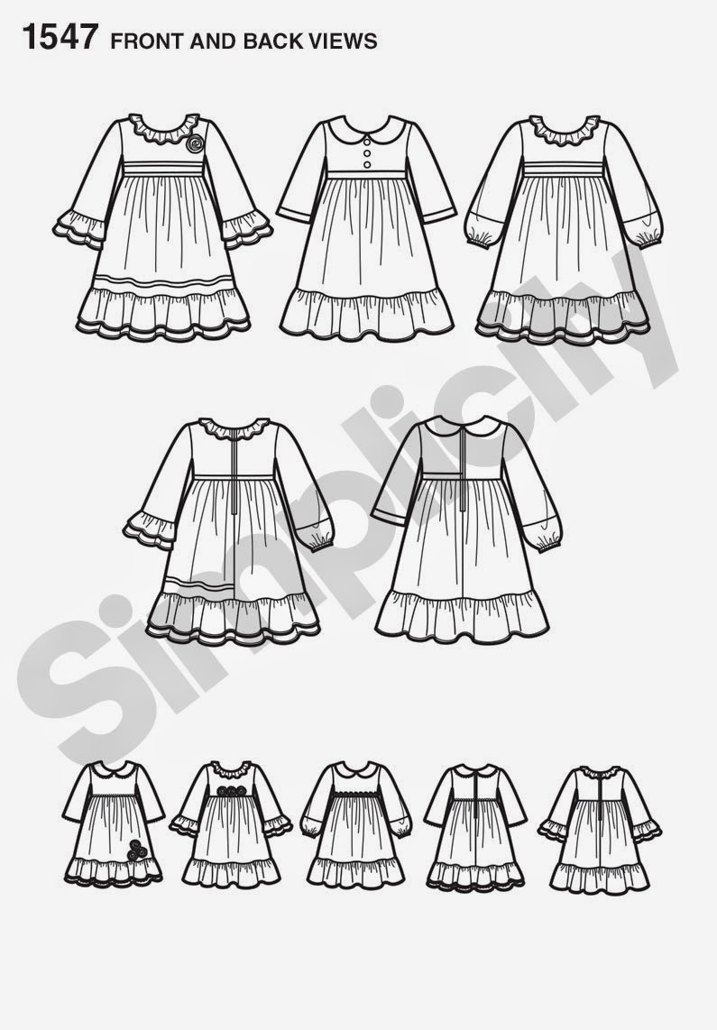
Simplicity 1547 Girls Dress Pattern Hack - Button Back to Elastic


Its been International Day here in our community! I didn't realise until a couple of days before that is quite important. A casual email from my daughters teacher said 'please send your child in national dress or in the colours of their flag'. Well, my kids are half Irish, half British, we don't really have a national dress from either side. We are not sports fans so we don't have any sports kits. I could have pulled together some sort of blue white and pink but that would not have addressed the green white and orange side and that would have upset the apple cart a little so at the last minute I realised I needed to make something. Living in Saudi Arabia means we have much less access to shops so I am planning on making much more for my kids and had even planned this elastic backed pattern hack already, it just wasn't going to look like a flag. I had even made a muslin. I wanted an easy-on easy-off woven dress for light cotton sun dresses and comfy dressing up dresses. I find shirring elastic a bit of a faff and not really resilient enough for my kids and I wanted to be able to embellish the front.

This uninterested scruffy creature is the same child that looks like butter wouldn't melt in her mouth in the picture above, honest!

From the front the pattern is not altered. This alteration would work on any dress with a fitted bodice and gathered skirt.


I chose this pattern as it has lots of pieces to work with for a whole range of looks that I am planning to make, watch this space, using a loose fitting sleeve, a collar  and various ruffles.


This back photo shows the 3 channels of elastic I added.

For the flag dress I used:
1 yard white cotton batiste/voile
1/4 yard green cotton broad cloth
1/4 yard gold quilting cotton
1 yard 3/8" wide flat elastic
1/2 yard red ribbon
1/2 yard navy ric rac or other trim


To alter the pattern I traced off the side, arm hole and shoulder of the back bodice,


Then widened it to match the back skirt. I also lengthened it by 1 1/2". I took 3/8" off the neckline all the way around as well.


I added all of my trim on the front bodice and gold ruffles on the bottom and I sewed the front bodice to front skirt as the pattern instructions, by gathering the green skirt. I didn't need to gather my back green skirt pieces as these are now the same width as the back bodice I just sewed theses as a straight seam. I sewed my shoulder seams as normal and repeated for a lining. The back lining does not have a waist seam, I overlapped the pattern pieces and cut it in one piece to save time.


I laid the lining over the outer shell right sides together and sewed around the neckline, clipped the curves, turned right side out and pressed.


I then sewed through the lining and outer shell to form channels for the elastic. I wanted 3 rows of elastic. Because I was using very sheer white fabric I did not mark my channels but I did switch to my walking foot which has a wider foot so I could use it as a guide to make sure my channels were exactly 1/2" wide so the elastic would fit through them nicely. I measured the elastic from a well fitting dress but the original pattern pieces would also work as a guide. I threaded it through with a safety pin.


After this I turned the dress inside out and sewed the side seams making sure to leave the front lining and back skirt lining free. I then checked the fit. This is really important even if the pattern is familiar as the elastic might need adjusting to get the fit right around the neckline.


I then turned it inside out again and flipped the front lining over to the back. I stitched the side seams together again as far as the waist. I could then pull it back to the front side covering the raw edges of the bodice. All that was left to finish now was the lining skirt side seams and hem, outer skirt hem, and I bound the arm holes. The binding was very fiddly for such a small garment so for my next dress I will add short sleeves.