Sunday, 11 September 2016

Colour Layering Samples

I follow a Facebook group called Linocut Friends. On this group there have been many recent discussions about reduction prints being very slow to dry. So, I thought about the available time I have for finishing assignment 3 and decided that creating samples would be sensible. The first sample I did compared two similar groups of colors which I plan to use in my reduction print. I also compared the effect of using inks with and without extender.


I noted which inks I used below and the bottom row of each pair is 50/50 extender and ink, the top row is just ink. The group discussions often commented that red was the slowest drying color so I compared two different reds; naphthol and rubine. All inks are caligo safe wash oil based relief inks, and the paper is Fabriano Rosapina.

This was very, very useful. I first of all learnt that the naphthol red gave a much smoother print, the rubine was quite patchy. This is not very clear on the photo of the sample below, but there was a big difference.


I was surprised by how the greens came out. 


The process blue (cyan) made a very bright green, I got a much better color with the prussian blue. These inks are so intense that color mixing can be really hard. To create green I used tiny, tiny amounts of blue and still got a very dark green.

When I got to the darker layers the 50/50 extender ratio was too transparent, but pure ink was a bit patchy, this did not make much difference to drying time.

I used this as an opportunity to practice blotting between layers, something I have not done before. I tried a few papers but found construction paper and pressure from a brayer most effective.

As to drying time, I left 24 hrs between layers and up until the last layers that was long enough for all layers to be dry before applying the next coat. There is 7 layers in total and only the last two, blue and brown/black took longer than 24hrs to dry. However, these last two layers are still tacky a week later. I think the absorbent Rosapina paper helped, I've made other multi-layered prints on less absorbent paper with much slower drying time. Possibly by layers 6 and 7 the paper cannot absorb any more ink?


Thursday, 25 August 2016

Experimental print experiments

So far my inspiration for this part of the course has been based around calligraphy and lettering. I've developed these ideas and now have two blocks inspired by NJA MAHDAOUI  and Arabic calligraphy and one inspired by music notation, Paul Klee and the process of creating my experimental block. Here are prints of my two blocks:


This is based on my name in Arabic cut in lino


And this is based in my initials in a Roman alphabet cut in japanese ply with files and nails.

I tried layering these


This print is on a paper bag. The paper was not absorbent so this took a very long time to dry and was a bit patchy.


I love the shapes created by repeating and layering this block, further abstracting the calligraphy.


These blocks are quite small, (15x20cm) so I would like to make a bigger piece by more repeating and layering. I also started to include collage of tissue papers printed with the same blocks which were semi transparent when laid over the other papers. All of these papers were packaging papers I found, many were not absorbent enough for effective printing.


These are my first two attempts, the second one was much better for tearing the paper and printing over it again. I developed this more:


Overall I created some nice textures here and am more pleased with the composition of this piece as the balance of value works better.


This composition is a bit jumbled.

I don't know whether to continue with this idea or try to rearrange my blocks with less collage and more composition through printing. I have some lovely silk tissue papers to try.

I originally wanted to add a third block to this, or even more, in foam, possibly portraits of my children but this is much harder than I anticipated. Maybe that stage of development will come for the final submission.


Thursday, 18 August 2016

Reduction Print Inspiration

I've looked at a few examples of reduction prints in preparation for developing my own design for Assignment 3 OCA Introduction to Printmaking. My original plan was to take a simple subject, a still life of some description, and try to create a clear form with accurate shadows and contours, like I did with my shell print in assignment 2. However, the prints I found of simple still life compositions do not create traditional forms in this way, yet they still make visual sense and have extremely high impact.

The most striking and well known of these is Still Life Under the Lamp, Picasso, 1962:


In this print there is striking contrast between the areas that are lit by the lamp, and those that aren't. The shadows on the apples are stark but do create a sense of form despite their simplicity. It is a very busy design. It has two areas of focus, the bulb and the glass. Many of the lines radiate from the bulb giving it emphasis as well as the white in the bulb. However, the larger area of white in the glass competes with this. I also wonder about the order of printing, which was first red or green? While I admire the technical skill and inventive approach to a simple subject, I am looking for a simpler aesthetic for my design, however I am very interested in the simple form of those apples.

This print is also at the British museum, but there is no image on line, Jacqueline Lisant, 1964


In a more traditional composition Picasso has used a comb to make interesting textures to create the shading then a separate block for the dark lines. I can imagine the comb lines being made quite freely, and love the looseness of this, the softness created by this texture is so different to the stark lines traditionally cut into lino. These highlights and shadows give a sense of form in a completely different way.

I have an exhibition catalogue, from 1990 of Picasso Linocuts containing these and many other prints, in the foreword it attributes the 'revolutionary method' of reduction linocut as an evolution of technique pioneered by Picasso. I cant help thinking though that surely for as long as people have been carving print blocks from any kind of material some form of reduction printing would have taken place, although it may not have been called this. The book goes on to say 'this required amazing forethought and an overall conception of the image as a whole, prior to printing' (Rossi). This is a statement I do agree with, and one I experienced with my multi block print for the last assignment.

Another artist I have looked at is Patrick Caulfield, these striking screenprints have simple compositions which make a big impact. I want to do a still life and notice how these images use simple composition rules such as the rule of thirds, and careful use of colour to create emphasis, and would  mostly work as reduction prints. Despite the flat colour and absence of shadows they still look like 3d objects, has the subtle use of perspective achieved this? Is this because the objects are so familiar, I am seeing form without it being represented? The Coloured Still Life, below, leads me to wonder what are the minimum elements of a still life that create form? I've started doing some designing and will try some pared down versions in response to this.


This print also uses layering to great effect, but this one would not work as a reduction. The shadows here create depth, even with such a small colour palette and little detail this image feels like leaves above the ground. I think the use of colour is important here, I know leaves are green and shadows are more likely to be a cool blue, so the image makes sense and the layers achieve depth.


Friday, 12 August 2016

Experimental Blocks

Assignment 3 of OCA Printmaking 1 requires creating a test linocut with experimental marks made from different tools. I was fairly limited in terms of tools available, I did not have access to power tools. I tried 3 different surfaces, wood, lino and foam. The wood was called Japanese Ply from Intaglio. It was very hard to cut. I imagined making clean straight lines with files and saws, this was much harder than I imagined. I also tried using chisels, screw drivers, nails and screws.


Of the tools that I hammered such as chisels, screw drivers and nails only the sharpest of these was effective, the others caused the wood to split. Small holes from nails and small chisels could make interesting textures in a print. The saw and file lines were much harder to achieve than I anticipated. The saw skidded making scratches and unclear lines. The file was easier to control but took an awful lot of time to make cuts deep enough to use in a print block.

My original plan for this block was to make a version of my initials, developing my lettering theme, in contrast to the curves of Arabic Calligraphy. My initial design had to be significantly revised after this block, I thought using a more stable block would enable me to cut these fine lines with no risk of it crumbling, but it would be too hard to cut all those lines with the tools I have available.


I made a similar range of marks in my lino block. The chisel marks also needed to be quite sharp but I got better results from tools such as screwdrivers in this softer block. Saw and file marks were equally hard to cut.


I don't anticipate using these marks for my experimental block as I am planning on cutting smooth curves based on Arabic Calligraphy which are unsuited to these tools. 

Lastly I used a sheet of foam which I was able to make marks in from a big range of household tools.


I used a range of drawing tools and kitchen items and got great varied results. I can see this being a great surface for printmaking due to the immediacy of the results. It would need to be mounted to make it easier to handle as it could be easily damaged and all marks would show on the print. I love the idea of drawing some portraits on this to print with.


Thursday, 7 July 2016

Paul Klee Exhibition Paris

During our holiday this year we were lucky enough to spend a day in Paris. We went to the Centre Pompidou and saw an exhibition of works by Paul Klee.


The first thing that struck me was the scale of the works, the majority of them were very modest, not grand canvases created by other artist's such as Picasso. I wonder how that affected his impact as an artist. I read about him after the exhibition and he said that 'I have attempted to transfer to large formats that which I have already done in watercolour' he wrote in 1930. 'Of course this cant be done so quickly or playfully'(Lampe, 2016). This suggests an experimental way of working, which may have been hampered by the time investment required for larger works. Working on a small scale also meant Klee was able to produce a large quantity of diverse works (Marnat, 1974).

Klee did produce etchings in the early part of his career, and in the later part of his career produced many mixed media paintings with unusual combinations such as oil and watercolour which were interesting to study to try and imagine his working processes and the way these media would be layered. Some of these mixed media paintings contained oil transfer paintings, which I think is a technique similar to back drawing, and produces similar results.


The primary difference between this and back drawing is that the ink is placed on the back of a drawing which is placed over canvas or cardboard and the lines are drawn from the front, on the piece of paper, transferring onto the canvas behind.

I was drawn to works which are based on symbols and calligraphy as this is an area I am exploring in my own artwork. 


The influence of Egyptian hieroglyphics are clear here. Other works show the influence of other symbols such as music notation, Klee was a lifelong musician


Paul Klee ~ Erzengel ~ 1938

In this work the symbols are arranged to look like an angel, a recurring theme in Klee's late work, representing the limit between life and death. The Arabic alphabet may have been an influence for these symbols. Earlier works were influenced by Egyptian hieroglyphs and Chinese calligraphy and a range of symbols, forming a distinct theme in Klee's work (Lampe, 2016). This theme began after a visit to Egypt and the work Little Vignette for Egypt 1918. This exploration of symbols lead Klee to the verge of abstraction in his own unique way (Marnat, 1974).

Erzengel is created on a thick hessian canvas, the texture of which clearly shows in the work. Klee was experimental in his use of surfaces and ways of preparing these for paint, these choices making a big impact on the final work, often showing through in places.

Some ideas I will take from this exhibition:
  • Explore using symbols including music notation
  • Explore creating stylized images with symbols or abstracted calligraphy
  • Use a range of surfaces for printing with varied textures

References:

Lampe, Angela. 2016, Munich: Prestel Verlag.

Marnat, Marcel. 1974, London: Spurbooks.


Saturday, 2 July 2016

Multi block prints

After completing my first multi block print I want to be more adventurous in my use of multiple blocks. My previous print could have been a reduction print, the layers were all the same image. To make a different use of this medium I want to try laying contrasting images over and alongside one another.

I have been looking at printmakers who do this. The first artist I looked at was David Salle and this print High and Low

This print uses lithography, screen print and woodcut. Each medium creates different textures and these are juxtaposed and layered. The different print mediums are used independently of each other to create a deliberately incoherent work. I wrote about Salle before when looking at Postmodernism. He is often cited in this context because of his works juxtaposing different styles. Bold geometric shapes make this lively work interesting to look at, and lead the eye around the different textures and colours.


Conversely this untitled wood cut uses multiple blocks to create one image. The blocks are more similar in their textures and subject matter and the images are layered rather than juxtaposed. This image is successful because all the blocks contain large areas of white so all three images can clearly be seen at the same time, and one layer, the bright red is able to stand out over the others. If more dense images were layered this may become less clear.


I recently visited the Irish Museum of Modern Art Where I was able to see a small selection of prints. Included in these were some works by Alice Maher some of which were also composed with multiple print techniques.


This print is a woodcut. It uses separate blocks of very different textures. Unlike Salle, these are combined to make a coherent image, with distinct elements.


This print is etching, aquatint and photopolymer. The three print mediums create very different textures which again are combined in one coherent image with separate elements.


I am interested in exploring these ideas through my experimental print. I would like to try combining some blocks made on different surfaces to create different textures. 

Friday, 1 July 2016

Abstract Calligraphy

Further to my tutors encouragement I am developing the ideas I began to explore in this post on Arabic Calligraphy.

In that post I looked at 2 works where the words had a significant message, one political, one religious. I wondered whether the use of these words drowns out more subtle visual ideas. The next work using calligraphy that I chose to examine abstracts the calligraphy so it does not create readable words.


KAUST Mosque Screen NJA MAHDAOUI
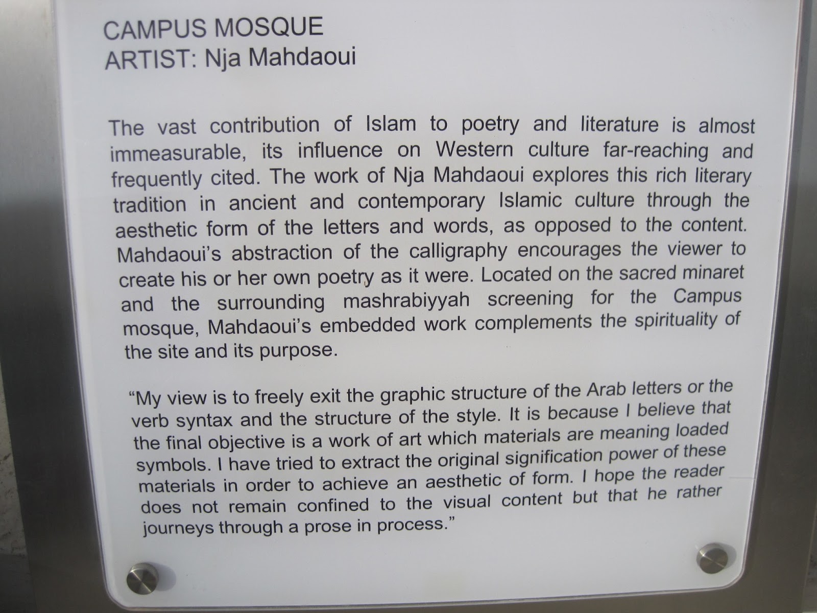
The Campus Mosque of the King Abdullah University of Science and Technology is part of the KAUST International Art Program – developed by KAUST & Aramco International – realized by Urban Art Projects – Jeddah, Saudi Arabia – 2010


This plaque placed outside the mosque eloquently describes this work. This idea of the 'aesthetic form of the letters and words' has been a central theme in Mahdaoui's work appearing in a wide range of works:


Mixed media on canvas 2002/7. In this work the calligraphy is quite textural not prominent


In contrast in this bronze Beya 2009 The calligraphy is bold and prominent


Mahdaoui also worked in print, this silkscreen 2010 uses the abstract calligraphy as a dominant subject and on a different scale texturally to great effect. I'm not sure how many layers have been used here as I have not used silk screen and do not know if it is possible to mix colours in one layer, or if the ombre is created by overprinting.

The first work, the mosque is near where I live so I went to see it and drew it from various angles including one of the screens:


On closer inspection I found the calligraphy of the screen is backed with a simple Islamic tessellation pattern.
This got me thinking about layers, this work has two distinct layers, the tessellations and the calligraphy, but in situ it has many more, such as the trees in front of it, the light from inside the building.

The calligraphy itself forms bold geometric shapes and is designed to encourage the viewer to 'make their own poetry'. Not being an Arabic reader I don't know whether there are any recognisable letters in this, my feeling is that there is not as Arabic script is formed of joined letters and this work is formed of many distinct separate shapes. It is a very effective way of exploring traditional Arabic culture. It is an interesting way of allowing viewers to have freedom over interpretation. This calligraphy can be interpreted in many different ways, unlike the first calligraphy I examined which had a clear religious message.

In response to this I began looking at some shapes based on letters. In further development of my ideas on exploring my identity at different times of my life I took my name in the font used on my birth certificate and my name in Arabic, representing me at the beginning and now in Saudi Arabia and explored deconstructing the shapes of the Arabic letters and conversely joining the English letters together


In this design the Arabic letters are prominent and fragmented. These shapes give a strong composition.


In this design I made a repeat pattern tile using this method of cutting the paper. In this design the English letters are equal in size but still slightly less prominent. This design is a bit less balanced.

If I was to cut this I would use a larger block and keep complete figures together, for example the wiggly shape at the top would be taken off and put on the bottom as a complete figure to make registration easier.

Some of these curves would be difficult to cut neatly, particularly keeping the thicknesses even where shapes overlap.

I'm going to look at some other ideas for abstracting text and revisit them all after I have cut my test experimental blocks and look at ways to develop and combine them.