In that post I looked at 2 works where the words had a significant message, one political, one religious. I wondered whether the use of these words drowns out more subtle visual ideas. The next work using calligraphy that I chose to examine abstracts the calligraphy so it does not create readable words.

KAUST Mosque Screen NJA MAHDAOUI
The Campus Mosque of the King Abdullah University of Science and Technology is part of the KAUST International Art Program – developed by KAUST & Aramco International – realized by Urban Art Projects – Jeddah, Saudi Arabia – 2010
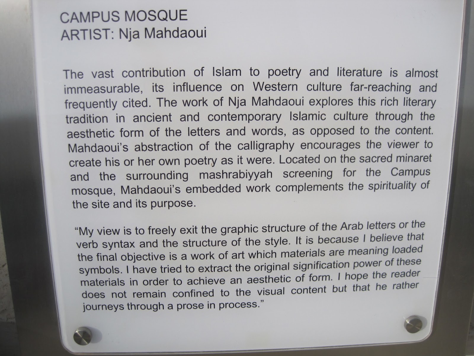
This plaque placed outside the mosque eloquently describes this work. This idea of the 'aesthetic form of the letters and words' has been a central theme in Mahdaoui's work appearing in a wide range of works:

Mixed media on canvas 2002/7. In this work the calligraphy is quite textural not prominent

In contrast in this bronze Beya 2009 The calligraphy is bold and prominent

Mahdaoui also worked in print, this silkscreen 2010 uses the abstract calligraphy as a dominant subject and on a different scale texturally to great effect. I'm not sure how many layers have been used here as I have not used silk screen and do not know if it is possible to mix colours in one layer, or if the ombre is created by overprinting.
The first work, the mosque is near where I live so I went to see it and drew it from various angles including one of the screens:

On closer inspection I found the calligraphy of the screen is backed with a simple Islamic tessellation pattern.

This got me thinking about layers, this work has two distinct layers, the tessellations and the calligraphy, but in situ it has many more, such as the trees in front of it, the light from inside the building.
The calligraphy itself forms bold geometric shapes and is designed to encourage the viewer to 'make their own poetry'. Not being an Arabic reader I don't know whether there are any recognisable letters in this, my feeling is that there is not as Arabic script is formed of joined letters and this work is formed of many distinct separate shapes. It is a very effective way of exploring traditional Arabic culture. It is an interesting way of allowing viewers to have freedom over interpretation. This calligraphy can be interpreted in many different ways, unlike the first calligraphy I examined which had a clear religious message.
In response to this I began looking at some shapes based on letters. In further development of my ideas on exploring my identity at different times of my life I took my name in the font used on my birth certificate and my name in Arabic, representing me at the beginning and now in Saudi Arabia and explored deconstructing the shapes of the Arabic letters and conversely joining the English letters together

In this design the Arabic letters are prominent and fragmented. These shapes give a strong composition.

In this design I made a repeat pattern tile using this method of cutting the paper. In this design the English letters are equal in size but still slightly less prominent. This design is a bit less balanced.
If I was to cut this I would use a larger block and keep complete figures together, for example the wiggly shape at the top would be taken off and put on the bottom as a complete figure to make registration easier.
Some of these curves would be difficult to cut neatly, particularly keeping the thicknesses even where shapes overlap.
I'm going to look at some other ideas for abstracting text and revisit them all after I have cut my test experimental blocks and look at ways to develop and combine them.
No comments:
Post a Comment