My final submission for this assignment has been sent off. I've really enjoyed these pieces and am feeling much more confident about printmaking.
The last piece is the reflection against the criteria for each piece.
Reduction Linocut

- Demonstration of Technical and Visual Skills
For this print I think I have got a good command of my materials. I did lots of samples and feel confident with my mixing of colors and paper choice (caligo safe wash and fabriano rosapina). However, my technique still needs working on. Layer 6 was too dark and too thick, it took a long time to dry, I had to adjust the color of the next layer and the overall print was too dark as a result. The composition is simple but effective and the observational skills are good, I think the sense of form is effective, although there is too much shadowing on the oranges. Often when I draw I create values too dark, I need to work on this.
- Quality of Outcome
I think I could further apply what I learnt to the print. I researched some great uses of flat color but did not experiment enough with applying this to my design.
- Demonstration of Creativity
I chose a fairly safe subject, to concentrate on observation and printing skills. For my next reduction I will be more adventurous. I think my use of color was creative and created good impact.
- Context
I found some interesting examples in my research which I think I analyzed effectively. I want to apply these ideas more to my artwork.
Experimental Test Linocuts

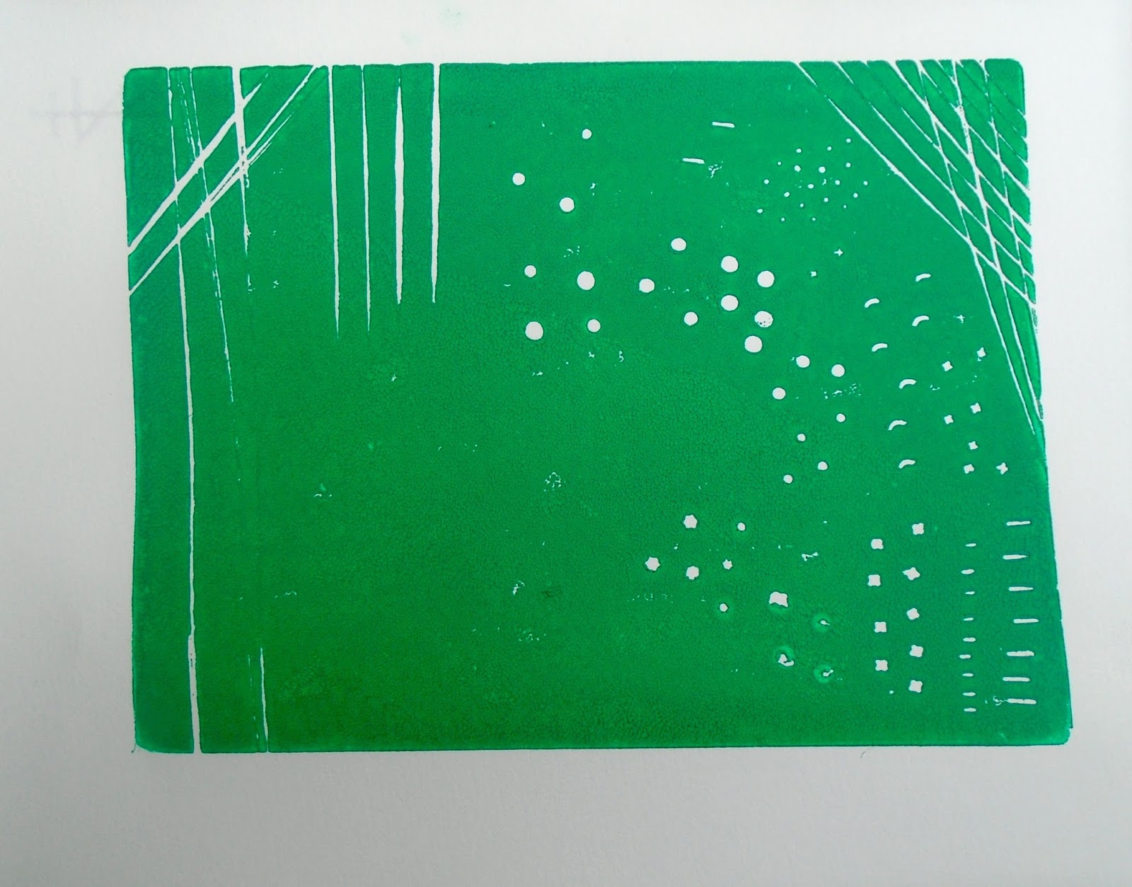
- Demonstration of Technical and Visual Skills
These prints were clear and many of the marks were effective. I did not compose these into a design, I wonder now if I should have done more on this task.
Experimental Prints

- Demonstration of Technical and Visual Skills
In these prints I explored a range of papers which was very effective in my final prints. I am really pleased with the composition and texture.
- Quality of Outcome
I think I communicated my idea of exploring my name in Arabic and English well.
- Demonstration of Creativity
The experimentation I did for this print lead to a well developed idea. I presented these examples well in my blog. More sketching of these ideas may have allowed me to explore other options.
- Context
I researched some experimental prints which got me started with ideas for combining images, but went in a different direction. I will go back to the ideas I researched at some point.


